
20 well-written blogs about popular topics vs. 1 solid comparison page. Which one would earn more customers for your product?
When a user searches for queries like ‘X vs. Y’, they are closer to a buying decision. They have already understood their problem, known about the existing solutions to it, and are now likely comparing them to find the best fit.
Thus, X vs. Y pages target BOFU traffic, which can convert easily. Blogs revolving around popular topics or TOFU content attract more traffic, but it ensures less conversion. Moreover, if someone is searching for ‘what is email-marketing?’ There are tons of blogs out there talking about the same topic, hence the competition is huge.
On the other hand, ranking comparison pages is relatively easy. You have to just work against review websites and your competitor’s comparison page. Even smaller SaaS companies with limited backlinks or brand awareness can rank for comparison queries if the page is well-written and well-structured.
Comparison pages help in building long-term SEO value. Because when your product becomes popular, more people will search for it and compare it with other similar products. And people spend more time on these pages. So one can get better scroll depth and time-on-page than other content pieces. You can continuously keep this page updated in case the product changes and grows and additional features are added.
Comparison pages also aid in link-building purposes which is a strong SEO factor. If people find the information in the pages unbiased and insightful, they are likely to refer to them which would build the website’s authority and boost rankings.
You can build your page around certain long-tail keywords that directly answer user questions, positioning your SaaS as an authoritative source. You can use a wide range of keywords to rank for things such as searches related to your product, your competitor’s product, or the comparison between the two.
Apart from BOFU traffic, you can also attract some of the MOFU traffic. Because alternative queries often appear earlier in the buying journey than direct comparisons. So users can enter your ecosystem before the final decision stage.
All this shows why comparison pages are essential in a SaaS content strategy. So how do you build a SaaS comparison page that actually converts? Let’s break it down.
The ideal structure of a high-ranking SaaS comparison page
Comparison pages are not just about aesthetics. A reader should understand at first glance what the comparison is about, why your product is the best one, and what action they should be taking next.
A clear structure emerges from the best comparison pages. Let us look into it in detail.
Have a clear hero section
The hero section should immediately make the purpose of the page clear to the reader. Even before they read the entire page, the headline and subheadings should communicate two things:
- What products are being compared?
- The benefit they will obtain after reading the page
You can approach this section in various ways. For example, strategically using your competitor’s name throughout the section in headings, sub-heading text, and social proof headline.
Or you can strategically highlight in the first few lines how your product is more valuable.
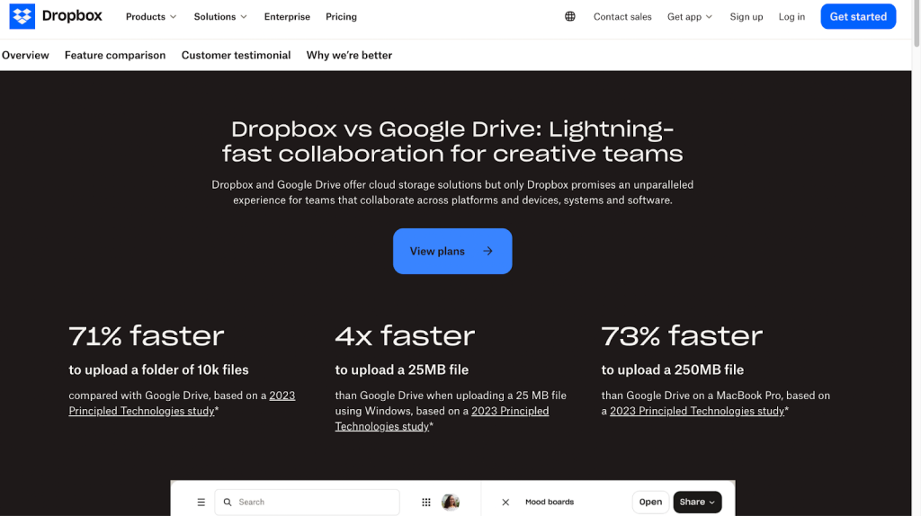
For example, in the case of the Dropbox vs Google Drive comparison page, Dropbox clearly emphasises how it is better than Google Drive in terms of collaboration in the first line itself:
“Dropbox and Google Drive offer cloud storage solutions, but only Dropbox promises an unparalleled experience for teams that collaborate across platforms and devices, systems, and software.”
In the case of some hero sections, showcasing the value of a product is a far-fetched idea because it isn’t even clear about the basics, i.e., there is no clear mention of the competitor’s name. The name might be lurking in a corner, making it difficult for readers to even understand that it is a competitor page.
Once your hero section establishes the comparison clearly, the next question is: where do users find this page?
Placement and navigation of the competitor page
Don’t place comparison pages in the footer, or deep inside the website where they are accessible only when one goes through numerous links.
When we understand the user journey, we are aware that users are bound to compare options at one point in time. So at that stage, they should be able to easily find the comparison page. A comparison page would drive them towards the buying decision. Hence, it is useful to place the page at the top of the site and not at the bottom where no one would notice it.
It’s not just the placement. Navigation should feel smooth too. For example, a competitor page can be designed in such a way that readers are able to access multiple competitors while staying on the same page.
This is where a ‘one vs many’ comparison table is helpful.
Comparison table can be of three types:
- One vs One
- One vs Many
- One vs All
In a ‘one vs many’ comparison page, the main product column stays fixed while users scroll through competitors. Each competitor usually links to a dedicated ‘one vs one’ comparison page for a more detailed comparison.
Focus on a clear differentiation angle:
Why should you not talk about your product solving generic problems?
Because the competitors also solve the same problem. You have to focus on where the difference actually lies.
For example, both Asana and Trello are project management tools. The generic solution that both platforms provide is making project management easier for teams. Here the prime difference may lie in how they approach project management or how their interfaces differ.
Emphasise how these differences would suit different people
For example, Asana’s advanced features suit complex project management tasks, whereas Trello’s simpler and highly visual kanban board style tracking works better for small teams.
The must-have components for your SaaS competitor page
A well-structured SaaS comparison page is built from a few essential elements that guide users toward a decision. These components help readers quickly understand the differences between products while also highlighting why your solution might be the better choice for their needs.
Each element serves a specific purpose in the buying journey. Some sections build clarity through comparison, others establish trust or reduce friction before switching products. When combined thoughtfully, these components can turn a simple comparison page into a strong conversion asset.
Call-to-action buttons
The different types of call-to-action buttons are:
- Free call
- Contact Us
- Request a Demo
- Live Chat
- Buy Now
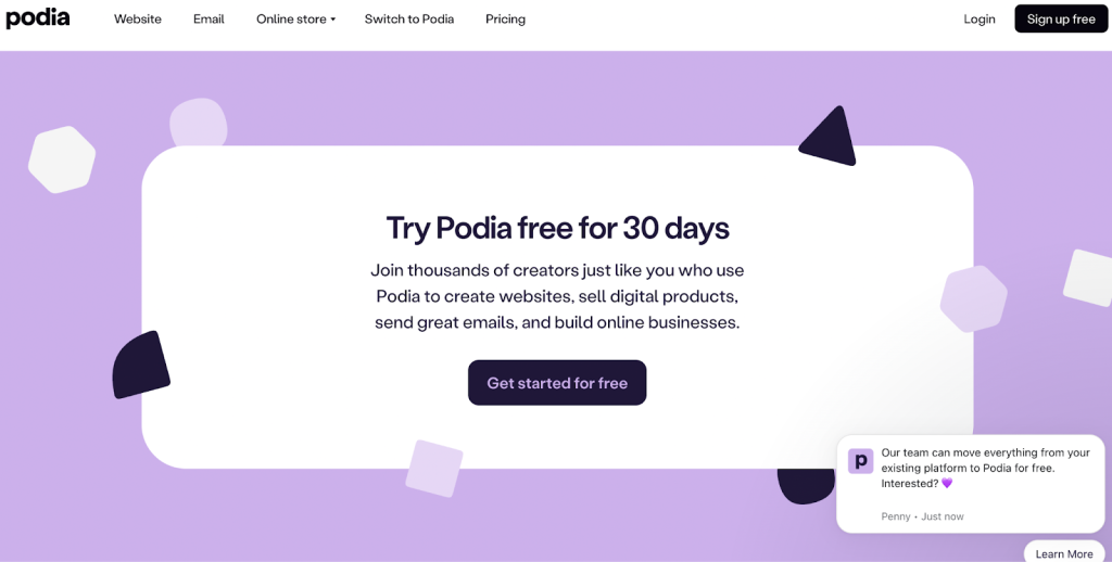
Out of these, ‘free trial’ and ‘request to demo’ are the most effective options. Because here the users aren’t put under pressure to buy anything. They have to just try things out first.
Check out this free trial CTA by Podia:
Use a comparison table
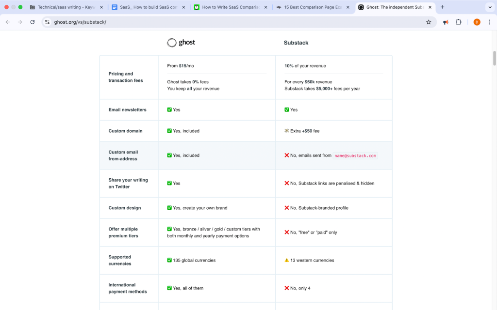
Comparison tables are a key element of these pages. But how to make them helpful?
If tables are too long, readers will be confused and bored. The mention of too many secondary features in a table isn’t going to help the user.
If tables only focus on the good side of your own product but demean the competitor, you would lose the trust of the readers.
Keeping the above points in mind, one can opt for minimalistic tables that describe the important features. Use short text for easy skimming. Incorporate the use of tick marks, checkboxes, and colors to make it more visually appealing and understandable.
Here’s an example of a minimalistic comparison page by Ghost:
Highlight unique features
The key to describing features effectively in your comparison page is to mention those features that differentiate the product, not the basic ones.
Instead of incorporating every major feature, one can go for 3 to 6 such unique features.
Or it would be even more effective to categorise these features under a theme. For example, use themes like speed, ease of use, and then under these, list out the unique features and the solutions they provide.
These features can be distributed throughout the page, or they can be highlighted with the help of testimonials and customer reviews.
Emphasise key solutions
Instead of focusing only on features, highlight the problems your product solves better.
Common SaaS solution themes include:
- ease of use
- flexibility
- collaboration
- customization
- performance
- customer support
Comparison pages usually focus on three to five key solutions. Or sometimes you can emphasise one key solution throughout the comparison page. This would become the main differentiator for your product and the competitor.
You can create sets of two or three key solutions and use each set to complement the unique features section and the customer reviews section.
Use trust-building elements or feedback
Only listing out features and solutions isn’t enough. You need proof that your product is better. This is where trust-building elements come in because they show your customer not just what you are saying about your own product but also what others are saying about your product. This eliminates bias.
Customer reviews, testimonials, ratings, and awards are some important trust-building elements.
It is important to have at least three trust-building elements or a combination of these.
For example:
– Customer reviews + Awards
– Ratings + Customer success stories
One can distribute these elements throughout the page and use them to support key solutions and unique features.
For example, at the top of the page, one can have media coverage and awards. In the middle of the page, one can put testimonials and customer reviews.
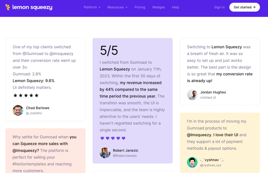
You can highlight those customer feedback where they have directly compared your product with the competitor, as is the case for lemon squeezy (the Gumroad alternative):
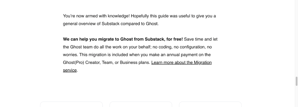
Offer migration support
When customers are checking your product, they might have already been using a similar product and want to switch over. At this stage, you should simplify the switching process for the customer. You can do that by providing strong migration support. Because a major problem that shows up while switching is that they already have a large amount of data on the other software and don’t want to lose it.
You can provide migration support to the customers in three ways:
- Automated data import
- Manual migration features with customer support
- Done-for-you migration by the company
It is a very important element of conversion. Because it assures the customers that they do not have to start from scratch.
It is thus positioned towards the end of a page as the final or second-final CTA. Check out this free migration offer from Ghost and how they have positioned it.
Use an FAQ section
The purpose of FAQs is to address common and important questions customers might have about the software.
FAQs also capture long-tail search queries and are related to the search intent. You can use keywords related to your product and your competitor’s product, improving SEO.
FAQs can cover questions related to features, migration support, pricing, differentiating factors, etc.
The goal is to keep the answers short and to the point. You can also link your answers to the rest of the sections of the page.
You can highlight the unique features and key solutions in the answers.
Supporting resources
Blogs, case studies, and ebooks are examples of supporting resources. You can create internal links between these resources to enhance your website.
Readers stay longer on a website when they come across a relevant educational blog post. They would then want to know more about your product. For example, they come across a product-led article that not only teaches them a solution to an existing problem they face every day but also teaches them how to use the product to solve it.
The types of blogs that can be featured towards the end of a comparison page are case studies, user guides, tips and tricks, etc.
Common mistakes that hurt comparison page performance
While comparison pages can be powerful conversion assets, they can also fail to perform if they are poorly structured or lack depth. Certain common mistakes reduce credibility, confuse readers, or weaken the differentiation between your product and the competitor.
Understanding these pitfalls helps you avoid them while building your page. Let’s look at some of the most common mistakes that can affect the effectiveness of a SaaS comparison page.
Using a generic template for your comparison page
By the time the reader lands on your comparison page, they have already gone through numerous research materials on review sites and competitor sites. Your comparison page should match that level of research — otherwise, the reader would be persuaded to leave. Which is why generic templates won’t work. You have to bring in the depth of research.
You have to understand the story and philosophy behind the product and its unique approach to users’ problems, and then let this reflect on the comparison page.
Overloading the comparison page with endless features
You have to know what features should stay and what should not make it to the page. Explaining features just for the sake of it mightn’t do anything for the user. Your purpose is to solve their problems and thus highlight relevant features that offer a solution.
A large comparison table loaded with tick marks and checkboxes might also be overwhelming for the user.
The goal here is to be selective. Focus on those features that matter to the client.
Hiding or demeaning your competitor’s strengths
Not being honest about your competitor’s strengths erodes your credibility. You do have to be critical of your competitor and point out their weaknesses, but you should do it respectfully.
Provide proof in the form of user reviews when you are talking about the weaknesses of the other. Do proper research about your competitors and stick to the facts. Don’t exaggerate your advantages and downplay their strengths. You can even recommend your competitor for a feature that is better than yours.
For example, if your competitor’s product is better for large teams, whereas yours is better for individuals, recommend your competitor for teams.
Even if you don’t recommend them, be respectful and never make false claims. It won’t take much time before you are caught.
Not updating your competitor page regularly
Both you and your competitor would come up with frequent updates or new features, hence it is important to review and edit your comparison page again and again.
Outdated information would be unhelpful to the reader. They might also figure this out themselves while researching. This would disappoint them, and they might leave. They might go elsewhere for up-to-date information, and you would miss out on your narrative.
Bringing it all together
SaaS comparison pages are one of the highest-converting assets in a content strategy. Hence, it is important to note the following takeaways from this article:
- Have clarity in the headlines and the hero section on what the comparison is about.
- Respectfully highlight your strengths in comparison to the competitor’s weaknesses. Use customer reviews and testimonials to prove your point.
- Be selective of the features you want to compare. Focus on what the audience truly needs.
- Make the best use of the important elements of a comparison page, such as unique features, CTAs, comparison table, FAQs, etc.
- Don’t talk about generic differences between you and your competitor. Focus on the specifics.
Use the above points to position yourself better against your competitors and lead in the conversion game.
Are you ready to build your first comparison page?
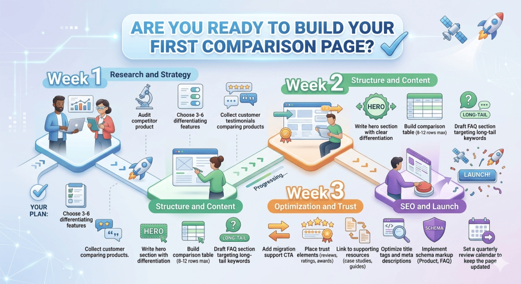
Here’s your week-by-week plan:
Week 1: Research and Strategy
- Audit competitor product
- Choose 3-6 differentiating features
- Collect customer testimonials comparing products
Week 2: Structure and Content
- Write hero section with clear differentiation
- Build comparison table (8-12 rows max)
- Draft FAQ section targeting long-tail keywords
Week 3: Optimization and Trust
- Add migration support CTA
- Place trust elements (reviews, ratings, awards)
- Link to supporting resources (case studies, guides)
Week 4: SEO and Launch
- Optimize title tags and meta descriptions
- Implement schema markup (Product, FAQ)
- Set a quarterly review calendar to keep the page updated.
Start with your top competitor, the one you lose deals to most often. Get that page ranking and converting, then expand to your next 2-3 competitors.
If you need expert help building high-converting comparison pages, h1copy is the right content partner for you. Our writers have worked with some of the biggest SaaS brands in the world — senior SaaS writers who understand complex products and buyer journeys. Feel free to reach out or ask for samples.
Frequently asked questions (FAQs)
What is a SaaS comparison page?
A SaaS comparison page is a webpage that compares your product with a competitor’s product to help users evaluate which tool fits their needs better. These pages typically highlight differences in features, pricing, use cases, and customer experience, helping potential buyers make informed decisions.
Why are SaaS comparison pages important for SEO?
SaaS comparison pages target high-intent keywords such as “X vs Y” or “X alternatives.” These queries often come from users who are already evaluating products, making them more likely to convert. Ranking for such keywords can drive qualified traffic and increase conversions.
What keywords should you target in SaaS comparison pages?
You should target comparison and alternative keywords such as:
- [Product] vs [Competitor]
- Best alternative to [Product]
- [Product] alternatives
- [Competitor] vs [Product] pricing
These keywords often signal strong purchase intent.
What should a SaaS comparison page include?
A high-performing SaaS comparison page usually includes:
- A clear hero section mentioning both products
- A comparison table
- Unique differentiating features
- Key solutions or use cases
- Trust signals like testimonials or ratings
- Migration support information
- FAQs and supporting resources
These elements help both with SEO and conversions.
How many features should be compared on a comparison page?
It is best to compare only the most relevant features, usually 8 to 12 key features. Listing too many secondary features can overwhelm readers and make the comparison difficult to understand.
How can SaaS companies highlight differentiation on comparison pages?
Instead of focusing on generic features, SaaS companies should highlight:
- unique capabilities
- specific use cases
- differences in product approach
- customer experience advantages
Explaining who each product is best suited for can help readers quickly decide.
Should you mention your competitor’s strengths on comparison pages?
Yes. Being transparent about your competitor’s strengths increases credibility. A balanced comparison builds trust with readers and makes your product’s advantages more convincing.
How often should SaaS comparison pages be updated?
Comparison pages should be reviewed regularly, ideally every quarter. Since SaaS products frequently release new features and pricing changes, keeping your comparison page updated ensures the information remains accurate and trustworthy.
Where should comparison pages appear on a SaaS website?
Comparison pages should be easy to find. They are often placed in:
- the main navigation menu
- product or pricing pages
- internal links within blog posts
Making them visible at the right stage of the buyer journey increases engagement and conversions.